Button
BsButton is a component for actions in form, dialog, and more with support for a handful of color variations, sizes, states, and more.
Overview
BsButton is the most commonly used component in a web page. The component is designed to meet the Google Material Design 3 specifications. Featuring with many options, making it easy to adjust to your needs.
INFO
- BsButton originally used Bootstrap CSS classes. However, since v2.2.0, BsButton no longer uses Bootstrap CSS. This improvement allows BsButton to work seamlessly with the TailwindCSS and Bootstrap CSS frameworks.
- The bundle only provide contextual color variants. It is located at
dist/theme-light.cssanddist/theme-dark.cssfiles. If the component style and color doesn't suit to your needs, you can customize it using the component's CSS variables or use the provided SASS mixins.
States
<bs-button> component has states: active, disabled and readonly. Use their respective property to enable the state.
Element Type
<bs-button> component by default renders a <button> element. However, you can also render an <a> element by providing href attribute value. You can also change the button's type attribute with specific value, such as button, submit, or reset.
Style Variants
You can adjust the <bs-button> to your own preference or use a style variant based on Google Material Design 3 specifications.
Filled
This style is the default button's style and its appearance is like Material Design 3 - Filled Button.
Updated in v2.2.1Filled Tonal
You can create button with filled tonal style like Material Design 3 - Filled Tonal Button by defining the tonal property explicitly.
Filled Elevated
You can create button with elevated style like Material Design 3 - Elevated Button by defining the raised property explicitly.
Filled Rounded
You can create button with rounded style by defining the rounded property explicitly.
Filled Rectangle
You can create button with rectangle style by defining the pill-off property explicitly.
Outlined
You can create button with outlined style like Material Design 3 - Outlined Button by defining the outlined property explicitly.
Flat
You can create button with flat style like Material Design 3 - Text Button by defining the flat property explicitly.
Combination
Other than those styles above, some styles can be combine to create another effect. Example below will shows you how to do it.
TIP
outlinedandflatproperty can't be combined. If bothtrue, thenoutlinedwill take precedence.- When the
tonalproperty is set totrueor defined,outlinedandflatare automatically disabled.
Icon
<bs-button> can have an icon inside it. The icon can be positioned on the left side (before text) or on the right side (after text) using icon-position property.
Use icon property to display an icon and sets the value to a valid android icon name from Google Material Symbols with or without a suffix. Valid suffixes are: _outlined, _rounded, _sharp, _filled, _outlined_filled, _rounded_filled, and _sharp_filled. Suffix _filled and _outlined_filled will display the same icon variant.
Beside using suffix, property icon-variant can also be used to set the icon variant. Valid values are: outlined (default), rounded, sharp, filled, outlined_filled, rounded_filled, and sharp_filled. Suffix will take precedence over icon-variant property.
Additionally custom icon can also be displayed using the icon slot and the icon property must be omitted.
INFO
Since v2.1.0, Google Material Icons are replaced with Google Material Symbols.
Rotating an icon
Additionally, you can also rotate the icon to some extent. Use icon-flip property or icon-rotation property to rotate the icon, but do not use both property together.
Animating an icon
<bs-button> also has built-in animations for icon, which are: spin and pulse. Example below, demonstrate the built-in icon animation and the use of icon slot.
Sizes
<bs-button> can be set to different size: xs (extra-small), sm (small), or lg (large).
With Icon
TIP
Other than standard/default button size and please adjusts the icon size using the icon-size property.
Icon Button
With <bs-button> you can also create icon button like Google Material Design 3 - Icon Button. Just use the mode property and sets the value to icon, <bs-button> will be rendered as icon button.
FAB
<bs-button> can also create FAB's button like Google Material Design 3 - FAB with just simple step. Use the mode property and sets the value to fab, <bs-button> will be rendered as FAB's button. The only downside is, <bs-button> doesn't have the ability to automatically position itself on the screen. You have to manually adjust its position on the screen using css helper or make your own css to adjust its position.
Extended FAB
Button Group
<bs-button> can be grouped as series of buttons like Google Material Design 3.
With dropdown menus
Button toolbar
<bs-button> can be grouped as series of buttons like Bootstrap.
Usage Example
The following are a collection of examples that demonstrate more advanced use of the <bs-button>.
Order menu item
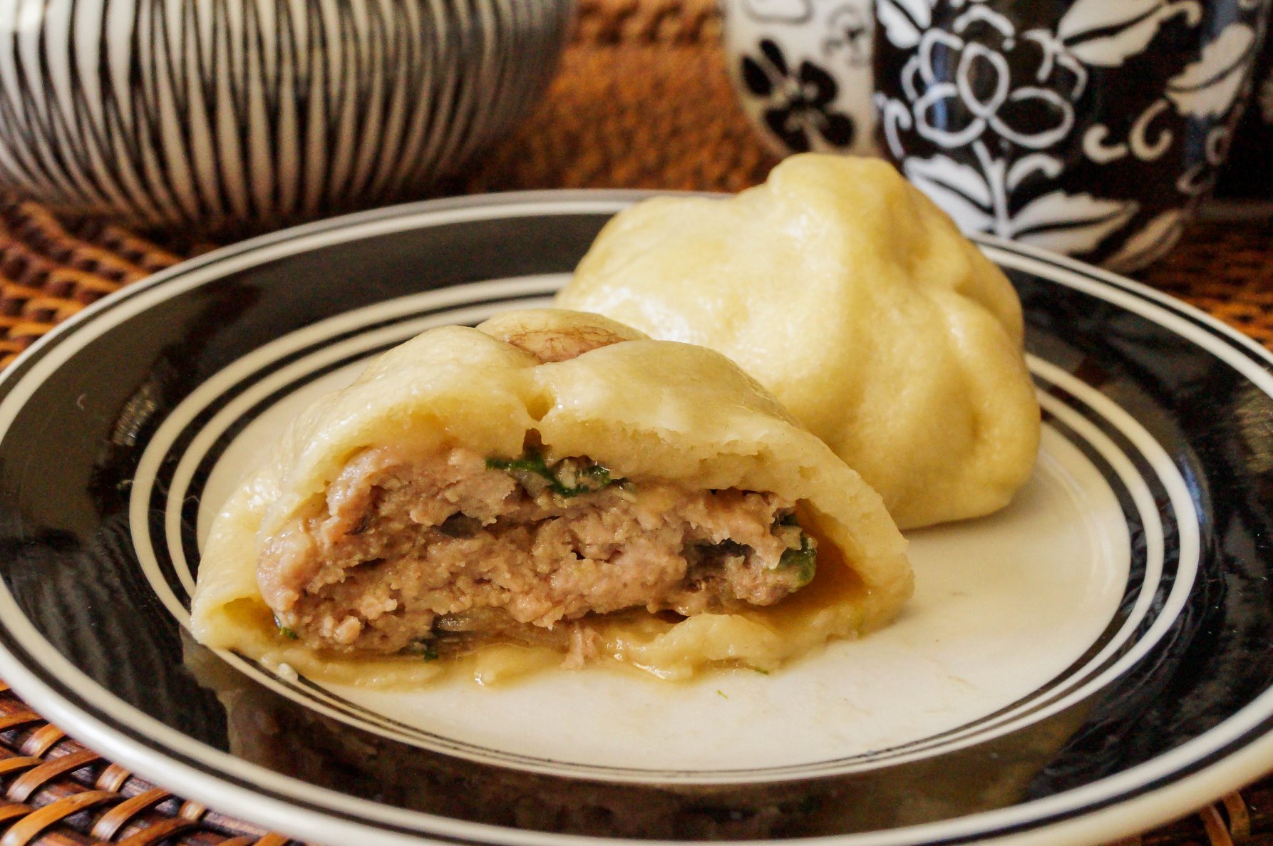
Pork bao buns$7.95
Made with barbeque-flavored sha siu pork and steamed to perfection, these pork buns are our most popular menu items.
Join video conference
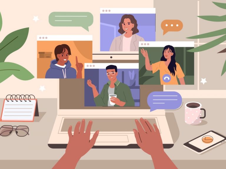
Etiqutte for the Internet
Two persons has joined.
CSS Variables
As CSS technology evolves, Vue MDBootstrap introduces local CSS variables on .md-btn, .md-btn-fab, and .md-btn-icon for better customization.
.md-btn, .md-btn-fab, .md-btn-icon {
  --md-btn-border-width: 0.094rem;
  --md-btn-disabled-bg: oklch(0.907 0.02 239.98 / 0.8);
  --md-btn-disabled-color: oklch(0.558 0.016 244.893);
  --md-btn-disabled-border-color: oklch(0.937 0.02 239.98);
  --md-btn-disabled-opacity: 0.6;
  --md-btn-readonly-opacity: 0.75;

  --md-btn-xs-font-size: 0.75rem;
  --md-btn-sm-font-size: 0.875rem;
  --md-btn-md-font-size: 1rem;
  --md-btn-lg-font-size: 1.25rem;

  --md-btn-font-size: var(--md-btn-md-font-size);
  --md-btn-font-weight: var(--font-weight-medium, 500);

  --md-btn-box-shadow: none;
  --md-btn-active-box-shadow: none;
  --md-btn-hover-box-shadow: 0 1px 2px 0 oklch(0.317 0 89.876 / 0.35), 0 2px 4px 2px oklch(0.145 0 89.876 / 0.05);
  --md-btn-focus-box-shadow: 0 0 0 0.25rem var(--md-btn-focus-shadow-color);
  --md-btn-focus-border-color: oklch(0.985 0 89.876 / 0.85);
  --md-btn-elevated-box-shadow: 0 2px 5px 0 oklch(0 0 0 / 0.16), 0 4px 8px 0 oklch(0 0 0 / 0.12);
  --md-btn-elevated-active-box-shadow: 0 1px 2px 0 oklch(0.317 0 89.876 / 0.35), 0 2px 4px 2px oklch(0.145 0 89.876 / 0.05);
  --md-btn-elevated-hover-box-shadow: 0 5px 11px 0 oklch(0 0 0 / 0.12), 0 4px 15px 0 oklch(0 0 0 / 0.1);

  --md-btn-bg: #{$bg-color};
  --md-btn-color: #{$color};
  --md-btn-border-color: #{$border-color};
  --md-btn-active-bg: #{$active-bg};
  --md-btn-active-color: #{$active-color};
  --md-btn-active-border-color: #{$active-border-color};
  --md-btn-hover-bg: #{$hover-bg};
  --md-btn-hover-color: #{$hover-color};
  --md-btn-hover-border-color: #{$hover-border-color};
  --md-btn-focus-shadow-color: #{$focus-shadow-color};
}
Button
.md-btn {
  --md-btn-xs-border-radius: 0.375rem;
  --md-btn-xs-line-height: 1;
  --md-btn-xs-padding-x: 1rem;
  --md-btn-xs-padding-y: 0.375rem;

  --md-btn-sm-border-radius: 0.625rem;
  --md-btn-sm-line-height: 1.3;
  --md-btn-sm-padding-x: 1.25rem;
  --md-btn-sm-padding-y: 0.4rem;

  --md-btn-md-border-radius: 0.625rem;
  --md-btn-md-line-height: 1.5;
  --md-btn-md-padding-x: 1.5rem;
  --md-btn-md-padding-y: 0.425rem;

  --md-btn-lg-border-radius: 0.875rem;
  --md-btn-lg-line-height: 1.5;
  --md-btn-lg-padding-x: 1.875rem;
  --md-btn-lg-padding-y: 0.75rem;

  --md-btn-border-radius: var(--md-btn-md-border-radius);
}
Icon button
.md-btn-icon {
  --md-btn-lg-width: 3.625rem;
  --md-btn-lg-height: 3.625rem;
  --md-btn-lg-line-height: 3.625rem;

  --md-btn-md-width: 2.625rem;
  --md-btn-md-height: 2.625rem;
  --md-btn-md-line-height: 2.25rem;

  --md-btn-sm-width: 2.125rem;
  --md-btn-sm-height: 2.125rem;
  --md-btn-sm-line-height: 2rem;

  --md-btn-xs-width: 1.75rem;
  --md-btn-xs-height: 1.75rem;
  --md-btn-xs-line-height: 1.5rem;

  --md-btn-border-radius: 50%;
}
FAB button
.md-btn-fab {
  --md-btn-xs-padding-x: 0.375rem;
  --md-btn-xs-padding-y: 0.375rem;
  --md-btn-xs-border-radius: 0.5rem;

  --md-btn-sm-padding-x: 0.5rem;
  --md-btn-sm-padding-y: 0.5rem;
  --md-btn-sm-border-radius: 0.75rem;

  --md-btn-md-padding-x: 1rem;
  --md-btn-md-padding-y: 1rem;
  --md-btn-md-border-radius: 1rem;

  --md-btn-lg-padding-x: 1.5rem;
  --md-btn-lg-padding-y: 1.5rem;
  --md-btn-lg-border-radius: 1.5rem;

  --md-btn-border-radius: var(--md-btn-md-border-radius);
  --md-btn-box-shadow: 0 1px 2px 0 oklch(0.317 0 89.876 / 0.35), 0 2px 4px 2px oklch(0.145 0 89.876 / 0.05);
}
SASS mixins
Sometimes, simply creating a new button color can be overwhelming, as there are too many CSS variables to modify. For cases like this, Vue MDBootstrap provides several SASS mixins to help you create new button style variants.
use 'vue-mdbootstrap/scss/mixins/button';

@include button.make-default-variant-light($name, $color);
@include button.make-outline-variant-light($name, $color);
@include button.make-flat-variant-light($name, $color);use 'vue-mdbootstrap/scss/mixins/button';
@include button.make-default-variant-dark($name, $color);
@include button.make-outline-variant-dark($name, $color);
@include button.make-flat-variant-dark($name, $color);