List Tile
BsListTile is a component used to display information. It can contain an image, content, actions, subheaders and much more. BsListTile represents content in such a way which makes it easy to identify a specific item in a collection. They provide a consistent styling for organizing groups of text and images.
Overview
For the <bs-list-tile> to work properly, it needs to be placed inside the <bs-list-view>. After that, you can arrange the list items to display the information in an organized way.
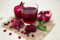
Images
The <bs-list-tile-leading> has built-in support for displaying image, and additionally we can use <bs-icon> inside the <bs-list-tile-action> to display an icon. And place <bs-list-tile-title> inside <bs-list-tile-content> to display the title. See example below, to learn how to display image with title and icon correctly.


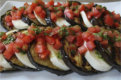
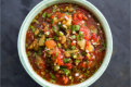
Multiline Content
Sometimes our page may contains data list with complex structures. For example, we want to display a list of data which contains image, title, description and another content. Example below will shows you how to create this complex data list structures.
Another Content Title
Quis magna Lorem anim amet ipsum do mollit sit cillum voluptate ex nulla tempor. Laborum consequat non elit enim exercitation cillum aliqua consequat id aliqua.
Security Warning
Dynamically rendering arbitrary HTML on your website can be very dangerous because it can easily lead to XSS vulnerabilities. Only use raw-html property on trusted content and never on user-provided content.
Custom Color
We can also make <bs-list-tile> to have different background color. To achieve this, just style the parent container with the desired background color then use local CSS variables to set the text color or use global CSS variables for consistent application UI color.
Another Content Title
Quis magna Lorem anim amet ipsum do mollit sit cillum voluptate ex nulla tempor. Laborum consequat non elit enim exercitation cillum aliqua consequat id aliqua.
Manageable State
Manage by ListView
If property navigable, url or path of <bs-list-tile> is defined explicitly, then the active state of <bs-list-tile> can be manage automatically by <bs-list-view> component when <bs-list-tile> is clicked.


Manage manually
If you wish to manage the <bs-list-tile> state manually, define the individual-state property of the <bs-list-view> component explicitly.
Navigation
Additionaly <bs-list-tile> can also be used to create navigation menus. Below is the built-in styles to decorate the navigation menus created with <bs-list-tile> component.
Item Padding
Item padding can be create using the space-around property of the <bs-list-view> component. Valid values for the space-around property are: left, right or both.
Item border
We can also give a border to the active navigation's menu. To achieve this, sets the item-border-variant property of <bs-list-view> component with value: left, right, left-right, top, bottom, or top-bottom.
Rounded style
Additionaly, we can also add additional style appearance to the navigation's menu. There are two built-in style appearance, which are: Rounded and Rounded Pill. To achieve this, sets the item-rounded property of <bs-list-view> explicitly to create rounded style, or item-rounded-pill to create rounded pill style to an active navigation menu.
Usage Example
The following are a collection of examples that demonstrate more advanced use of the <bs-list-tile>.
Contact Details

Used with Input Controls
Sometimes we want to create a complex page layout like android setting. <bs-list-tile> also can be used to create this page. We can place some input controls inside the component to enable/disable the application setting. Example below will shows you how to create application setting page layout.
Inside Side Drawer
<bs-list-tile> can also be used inside <bs-side-drawer> to create side navigation menus.
CSS Variables
As CSS technology evolves, Vue MDBootstrap introduces local CSS variables and global CSS variables for better customization.
Updated in v2.2.0List View
.md-list {
  --md-listview-bg: inherit;
  --md-listview-color: var(--navigation-item-foreground);
  --md-listview-item-gap: 0;
  --md-listview-padding-x: 0;
  --md-listview-padding-y: #{vars.$padding-sm};

  --md-tile-minheight: 2.5rem;
  --md-tile-action-minwidth: 1.5rem;
  --md-tile-spacing-x: #{vars.$padding-sm};
  --md-tile-spacing-y: 0.375rem;
  --md-tile-padding-x: #{vars.$padding-md};
  --md-tile-padding-y: #{vars.$padding-sm};
  --md-tile-subtitle-font-size: #{math.div((vars.$font-size-base * 90), 100)};
  --md-tile-title-font-size: var(--font-size-default);
  --md-tile-title-font-weight: var(--font-weight-normal);
  --md-tile-active-title-font-weight: var(--font-weight-medium);
  --md-tile-disabled-opacity: var(--md-field-readonly-opacity);
  --md-tile-indicator-border-color: var(--navigation-item-border-indicator);
  --md-tile-indicator-border-width: 4px;

  --md-nav-item-padding-x: #{vars.$padding-md};
  --md-nav-item-padding-y: #{vars.$padding-xs};
  --md-nav-item-line-height: normal;
  --md-nav-item-font-size: var(--font-size-default);
  --md-nav-item-font-weight: var(--font-weight-normal);
  --md-nav-item-active-font-weight: var(--font-weight-medium);
  --md-nav-item-disabled-opacity: var(--md-field-readonly-opacity);
}
List Tile
.md-list-tile {
  --md-tile-action-color: var(--navigation-item-foreground-secondary);
  --md-tile-leading-color: var(--navigation-item-foreground);
  --md-tile-leading-icon-color: var(--navigation-item-foreground-subtle);
  --md-tile-subtitle-color: var(--navigation-item-foreground-secondary);
  --md-tile-title-color: var(--navigation-item-foreground);

  --md-tile-active-bg: var(--navigation-item-active-background);
  --md-tile-active-action-color: var(--navigation-item-active-foreground-secondary);
  --md-tile-active-leading-color: var(--navigation-item-active-foreground);
  --md-tile-active-leading-icon-color: var(--navigation-item-active-foreground-secondary);
  --md-tile-active-subtitle-color: var(--navigation-item-active-foreground-secondary);
  --md-tile-active-title-color: var(--navigation-item-active-foreground);
  --md-tile-hover-bg: var(--navigation-item-hover-background);
}:root {
--navigation-background: var(--background-secondary);
--navigation-item-foreground: var(--foreground);
--navigation-item-foreground-secondary: var(--foreground-subtle);
--navigation-item-foreground-subtle: var(--foreground-subtle-secondary);
--navigation-item-active-background: #{vars.$default-active-bgcolor};
--navigation-item-active-foreground: #{helper.to-oklch(
color.change(color.scale(vars.$default-active-bgcolor, $lightness: -10%), $alpha: 1)
)};
--navigation-item-active-foreground-secondary: #{helper.to-oklch(
color.change(color.scale(vars.$default-active-bgcolor, $lightness: -10%), $alpha: 0.75)
)};
--navigation-item-hover-background: #{vars.$default-hover-bgcolor};
--navigation-item-hover-foreground: var(--foreground);
--navigation-item-hover-foreground-secondary: #{colors.$gray-600};
--navigation-item-expanded-background: oklch(0 0 0 / 0.025);
--navigation-item-border-indicator: var(--md-field-active-indicator);
}SASS mixins
Sometimes, simply creating a new ListTile color variant can be overwhelming, as there are too many CSS variables to modify. For cases like this, Vue MDBootstrap provides SASS mixins to help you create new ListTile color variants.
use 'vue-mdbootstrap/scss/mixins/listview';

@include listview.make-listview-variant($name, $color);
API Reference
BsListView
BsListTile
BsListTileAction
A container for less important parts of item or for actionable component.
BsListTileLeading
A component for important parts of item. An avatar, image, or icon is usually placed inside this component.
BsListTileContent
A container for item's description. Inside it, you can put component such as <bs-list-tile-title> and <bs-list-tile-subtitle>.